
Five graphs show that solar energy takes over the world
The solar energy It is in "fashion" and it is an undeniable question, although many professionals in the sector did not find a clear way to express what is really happening in the world of renewable and, in particular, with reference to possibly the 'cleanest' and cheapest energy of all, solar energy. If we already talk about his second brother in the article the future of wind energy showing that in recent years there is an unprecedented revolution, now through graphics We will check why solar energy is the Top Ten of renewables.
As part of the article and in reminder mode.
How does solar energy work
We want to add this excellent infographic to get to understand the operation of this renewable energy in a simple way. Your solar panel and the characteristics of use and staging.
Image that defines the operation of solar energy:
(By clicking on the image it is enlarged in PDF to Junta Andalucia)

Analysis of energy advances and evolution withsolar energy images:
1. Graphical solar panels installed
The forcefulness is overwhelming if we look at the installed panels since 1975 and, in particular, in the last 10 years. Possibly the most revealing graphic.
2. Solar energy price graph
One of the solar energy images par excellence is undoubtedly if we apply the Law of supply and demand of markets before the previous graph we will obtain a sale price that is reaching low minimums.

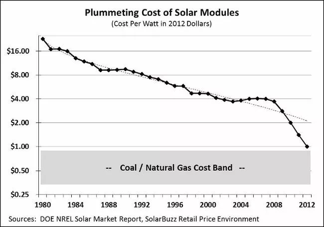
3. Solar panel cost graph
Refering to evolution of solar panels. The cost of installing modules-solar panels is falling. A market where many companies have begun to take advantage of economic opportunities without detracting from the technological advances that are taking place every day in the sector. (See also the article on the latest technology in solar panel and consult its all characteristics here)
4. Graph entry of solar energy in the market
This graph is especially striking, dating back to 1949. It was so expensive that even in recent years it has not appeared on the graph.

5. Graph of solar power generation capacity worldwide.
Not only is the increase in the capacity to generate more solar energy, it is the consequences that this aspect supposes - example - in the labor sector that we already contrasted in the article reflections on renewables where the estimate of jobs created in the renewable sector reaches the extraordinary figure of 6.5 million jobs.

It should be noted that renewables are providing lasting and stable employment to society. From the article on employment in renewables, it is revealed that the International Renewable Energy Agency (IRENA) highlights that around 7.7 million people now work in the renewable energy sector worldwide in 2015.
It is recommended to see the article of the Public newspaper in evolution, perspective and future of solar energy - photovoltaics… HERE.
Points of reference:
- Energy Policy Network 2014
- World Bank, Bernstein analysis
- Energy.gov
- Blooberg: New Energy Finance
Links of interest:
- Environmental images (7 strong images)
- Led lamps projects (How they are revolutionizing light)
- Energy efficiency guides (More than 100 manuals)
- Natural lighting in architecture
- LED lighting and its advantages
- Architecture images
- Ecological urbanism
If you liked this article, share it!


